
Fedilab
4.4star
1.48K reviews
10K+
Downloads

Teen
info


About this app
Fedilab is a multifunctional Android client to access the distributed Fediverse, consisting of micro blogging, photo sharing and video hosting.
It supports:
- Mastodon, Pleroma, Pixelfed, Friendica.
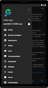
The application has advanced features:
- Multi-accounts support
- Schedule messages from the device
- Schedule boosts
- Bookmark messages
- Follow and interact with remote instances
- Timed mute accounts
- Cross account actions with a long press
- Translation feature
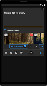
- Art timelines
- Video timelines
It's an open source application and the source code is available here: https://codeberg.org/tom79/Fedilab
It supports:
- Mastodon, Pleroma, Pixelfed, Friendica.
The application has advanced features:
- Multi-accounts support
- Schedule messages from the device
- Schedule boosts
- Bookmark messages
- Follow and interact with remote instances
- Timed mute accounts
- Cross account actions with a long press
- Translation feature
- Art timelines
- Video timelines
It's an open source application and the source code is available here: https://codeberg.org/tom79/Fedilab
Updated on
Safety starts with understanding how developers collect and share your data. Data privacy and security practices may vary based on your use, region, and age. The developer provided this information and may update it over time.

This app may share these data types with third parties
Personal info

No data collected
Learn more about how developers declare collection

Data is encrypted in transit

Data can’t be deleted
Ratings and reviews
4.4
1.4K reviews

Sheila Mihardja
- Flag inappropriate
November 24, 2022
Overall a great app compared to the free ones out there. Has a more seamless transition between web vs the app. The only thing I have an issue with is dark mode. Some of the features (like pop ups) use black text colour and don't automatically switch to a lighter colour if you're in dark mode so there are some visibility/readability issues.
17 people found this review helpful

Brett Carlock
- Flag inappropriate
November 11, 2022
Great Mastodon client that misses a few usability marks for me, but otherwise it's incredibly feature rich and customizable. I'd love to see list management and assignment to lists improved to take less steps and be more obvious if someone is on a list at all. I'd also love to see a bit more customization around the menu bars layout and positioning.
20 people found this review helpful

Mae Stark
- Flag inappropriate
- Show review history
January 11, 2023
Edit: Just to reply to the dev (thank you for your response), I mean that I'd prefer slightly MORE compact posts. Not by much, though. Maybe a few pixels or so. But thank you! So far, it's a lovely app. The ability to fine tune the UI is invaluable, and the functional settings are very robust and customizable. I think the only thing I'd want for the near future is slightly slimmer spacing between posts. Otherwise, very big fan already.
38 people found this review helpful
tschneider
January 11, 2023
Thank you for your feedback. Have you tried in Settings > Theming > Elevated cards. That will bring more space between messages.
What's new
Added:
- Display a QR code on profiles
Fixed:
- Fix tap on messages in conversations
- Pronouns taking too much place
- Display a QR code on profiles
Fixed:
- Fix tap on messages in conversations
- Pronouns taking too much place


